I often see competitor comparison landing pages that lose trust and authority by overstating the case of their own product or service.
Sometimes these pages misunderstand the search intent of the target audience by prioritizing product-led content over educational information. On other occasions, I see too much information when a single line or less would be sufficient.
In all of these cases, a better appreciation of why and how we should use comparison pages would improve search engine performance, CTR, time-on-page, and conversion rates.
This process begins with understanding your ICP, knowing the different ways you can approach keyword research, and aligning content creation with the user’s stage in the buyer’s journey.
In this article, I’m going to:
- Talk through the strategic value of competitor comparison pages
- Look at how you can carry out SEO and ICP research
- Cover important ground rules for different kinds of competitor comparison pages
- Analyze two real-life examples: One for video conferencing tools, and another by Zapier for conversion optimization
With these insights, you’ll be equipped with essential knowledge you can use to create ranking competitor comparison pages that resonate with your target audience.
Understanding SEO comparison pages: An overview
You might not want to be writing about your competition, but comparison pages fulfill a very important strategic role.
Their key purpose from a search intent perspective is to help your reader make an informed purchase decision about which tool to select for their business. From your point of view, though, they get you into the conversation, allowing you to pit your offering against your competitors and showcase your strengths and UVP.
And remember, these readers are your target audience; they’re comparing benefits, features, and pricing; and they’re at the bottom of the sales funnel—they’re up for grabs.
The argument against the argument against
Nevertheless, I speak with lots of people in marketing and demand generation departments who are reluctant to implement comparison pages.
This is understandable—you don’t want to give your competition the airtime, you’re worried you might end up pushing a lead to someone else, you don’t want to be overly negative, and you certainly don’t want to be too positive.
BUT here are a few things to consider:
- The reader isn’t just idly wandering around your blog and stumbling on an article about your competitors—they’ve actively searched this comparison out.
- If you don’t create this comparison landing page, your reader will find it elsewhere—probably on your competitors’ pages where you can’t control the narrative.
- You can take those readers away from your competitors, even if their original search was a “competitor vs competitor” keyword that didn’t feature your brand at all.
- You can use your comparison pages to address queries and barriers your leads often experience before converting.
- We’re helping people make a purchase decision here, so the conversion rate is much higher than normal educational/authority-building content.
Competitor comparison landing pages: Keyword research
Your keyword research for a comparison page needs to identify the phrases and questions potential customers use when looking to compare products or services.
Tools like Google’s Keyword Planner, Semrush, and Ahrefs can tell you about these keywords, their search volumes, and their competition levels.
In fact, Ahrefs uses SEO AI and combines data from Google and Clickstream to provide metrics on clicks and offer keyword suggestions. Also, you can use Google Suggest to generate lots of ideas based on popular searches.
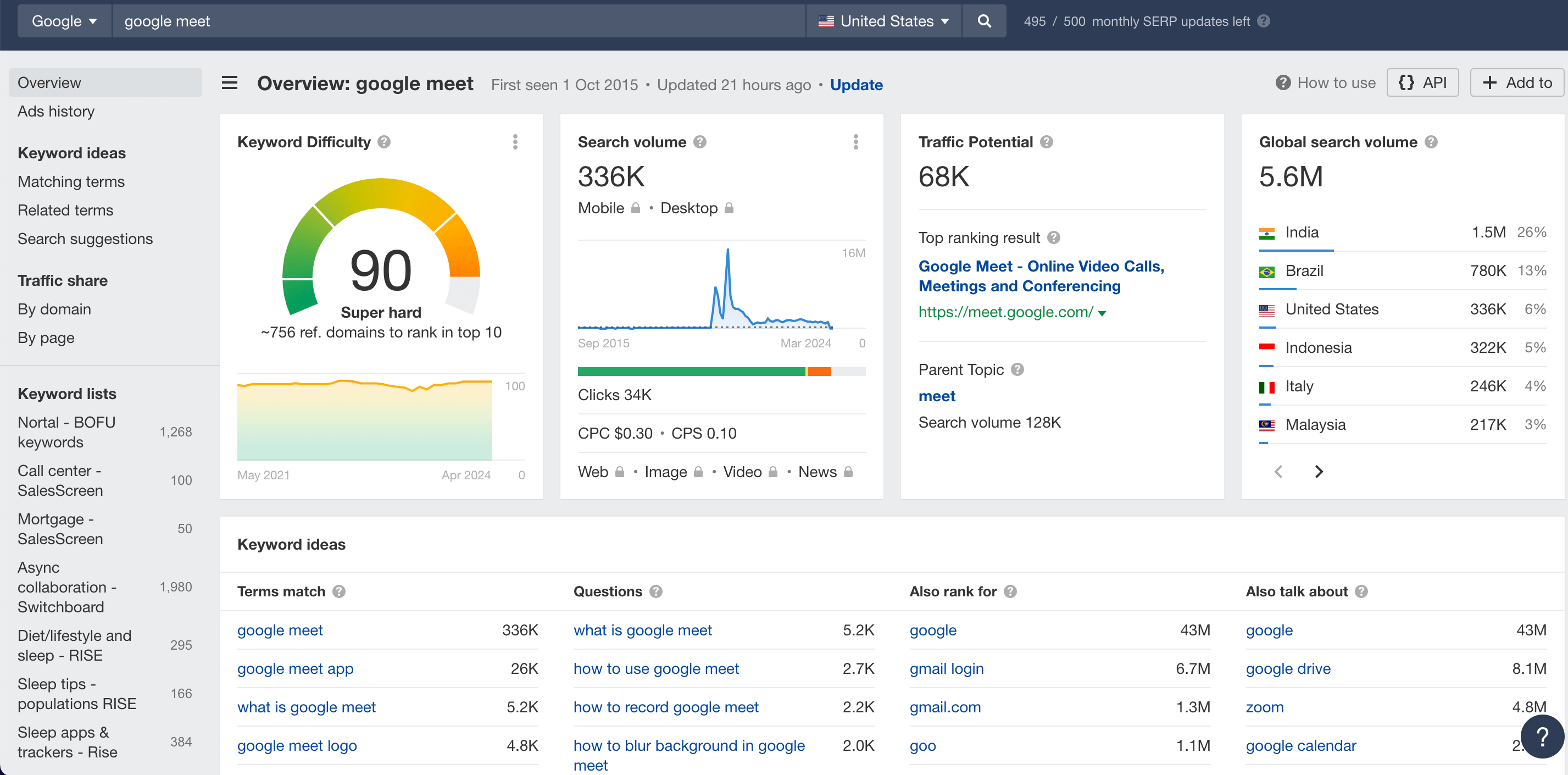
But you can get a headstart just by being aware of the most common bottom-of-the-funnel comparison searches. Here are some examples of typical comparison page search terms:
- [Your brand] vs [Competitor]
Even if the search volume for your brand is low, you can still capitalize on any niche interest, which is often high-intent and conversion-oriented. - [A Competitor] vs [Another Competitor]
You can get a foot in the door here by adding your brand to the search term, so the piece becomes “[Competitor] vs [Competitor] vs [Your brand]” - Alternatives to [Competitor]
If you’re an established brand, you’ll have probably already seen competitors mentioning you in their own alternative articles.
As you look to select competitors or product areas your target audience is most interested in, as well as SEO tools, use your own site data to see which features receive the most queries. Also, scan customer forums and review sites for mentions of competitors.
By integrating popular search terms with insights about the market and your ICP, along with data from SEO tools and your own website analytics, you can ensure your comparison pages are not only SEO-friendly but also genuinely useful to your readers. Ultimately, this will help them understand what makes your software distinct and valuable for solving their specific problems.
Understand your ideal customer profile (ICP)
You need to know who your landing page is intended for, their motivations for purchasing, and the barriers they face. With these insights, you can create content that will resonate with your target audience.
Here are three steps you can take to help understand the needs and behaviors of your ICP.
1. Know their role in the buying process
Identify the typical roles your ICP holds in their organization. Are they decision-makers, influencers, or end users?
For example, if they need to convince a CEO, provide them with the cheat sheet they need to get approval. Equip them with clear, concise data points, benefits, and ROI calculations they can present to higher-ups to make a persuasive case for your solution and secure buy-in.
2. Identify pain points
Pinpoint the specific challenges and frustrations your ICP faces.
What limitations do they encounter with current solutions? Use your sales and customer success teams to gather insights on common questions and concerns, and to understand what benefits are most important to them.
3. Know what they value most
Does your ICP prioritize ease of use, robust functionality, scalability, or responsive customer support?
Discuss how your software aligns with these values, where possible, differentiating it from competitors in the market.
Understanding these key aspects of your ICP will help you make your content more immediately impactful and engaging to them. You’ll be able to speak directly to the issues that concern them most, and, ultimately, you’ll be better placed to drive conversions.
Writing your SEO product comparison pages
We’re going to look at two kinds of product comparison pages: Those for readers who are drifting from middle to bottom of the funnel and those who are at the point of converting.
In both cases, I’m going to talk through the key considerations and then look at a real-life example.
Decision-guiding comparison pages for middle-to-bottom funnel audiences
Google’s guidelines on product reviews provide a useful breakdown of how to approach comparison pages, but the key thing to remember is you need to respond to the reader’s search intent.
So, if the search term is “Best video conferencing tools for teams in 2024”, first think about what the reader is trying to achieve, which you can usually confirm by looking at the current performing pieces for that term.
In this case, we can assume they want a listicle of tools that will help them make a decision on the right conferencing platform for their business.
To respond to this search intent in a way that provides genuine value, and therefore has a stronger chance of ranking, you need to:
- Demonstrate that you’ve conducted meaningful research that will save the reader time
- Share a current list of top tools within that space
- Provide insights that help the reader make an informed decision
But, also, you need to:
- Present your findings in a digestible format
- Use imagery and data to enhance understanding and engagement
- Highlight and summarize key decision-making factors, like price or user-friendliness, as well as core benefits like time-saved or better participation in meetings
On top of these core considerations, you also need to:
- Speak at the reader’s level (are they an enterprise executive or small business owner?)
- Address common concerns that not only educate the reader generally but also add value to them as a qualified lead
- Successfully differentiate your brand from the others in the article
That may seem like quite a lot of ideas to pile into a single article—and, let’s be honest, it is—but you can do it by:
- Carefully planning your article at the outline stage
- Establishing authority and relevance as early as possible in the piece
- Using a highly structured format
For example, you can use your introduction to detail your research process and explain how the article responds to the search intent—something like:
To arrive at this top-5 list of best video conferencing tools, I researched 17 different platforms, tried out the software myself, and trawled through more than 100 user reviews. I’ve broken down each tool by feature set, integration capability, customer support, and pricing.
Also, you’ll see comparative performance charts so that by the end of the article, you’ll be able to make an informed choice on the right tool for your team.
Extra gold:
Before the reader gets to see your introduction, there’ll need to be something compelling in the meta description for them to click through to your piece. For that, you’ll need to condense the core proposition of your article into 150 characters. Something like:
See the top video conferencing tools for 2024. Reviews on features, integrations & pricing so you can make an informed choice for your team.
Now, you can think about the main body of the article. There are lots of different ways to build a product comparison page, and I can’t look into detail at all of those approaches here, but there are a few important points to keep in mind:
1. In most cases, you’re going to feature your offering first. That’s fine—but try to resist the temptation to go top-heavy.
What I mean is, don’t write 750 words on your software then only devote 80 words to each of the following tools. Remember, for your page to rank and for the reader to trust you, you’ll need a more objective and balanced approach.
2. Similarly, be prepared to make a few concessions.
If one of your competitors is especially strong in customization, it’s ok to recognize this. Your goal is as much to position yourself as a trustworthy leader in the space as it is to win conversions. Just be sure to differentiate yourself from the competition in a way that will resonate with your ICP.
3. Support your comparisons with data whenever possible.
This could include performance metrics, uptime statistics, or customer satisfaction ratings. Data not only adds credibility but also helps the reader make a more informed decision.
4. Include customer testimonials.
Where possible, include quotes or case studies from existing customers who have used your product and your competitors’ products. This real-world proof can enhance credibility and influence decision-making.
5. Use visuals to support your research and add insights.
For example, use screenshots of the platform as the reader will experience it—don’t just share an image of the website. Also, a feature comparison chart can be a great way to get the reader to stay on page longer and keep on returning to your article as they close in on their choice.
6. Use a repeated structure for each review.
This makes your article more scannable, which is important for busy decision-makers. Also, it’s helpful for the writing process. For example, you might have each review follow a structure like this:
- Tool Name
- Platform image
- Overview, including who it’s aimed at, pros and cons
- List of features
- Pricing information
- User quotes
Decision-guiding comparison page analysis
I took a look at an SEO product comparison page that uses a “Best [offering] for [audience]” keyword that pitches Pumble against some of the biggest brands in the video conferencing space.
Here’s the article: https://pumble.com/blog/best-video-conferencing-software/
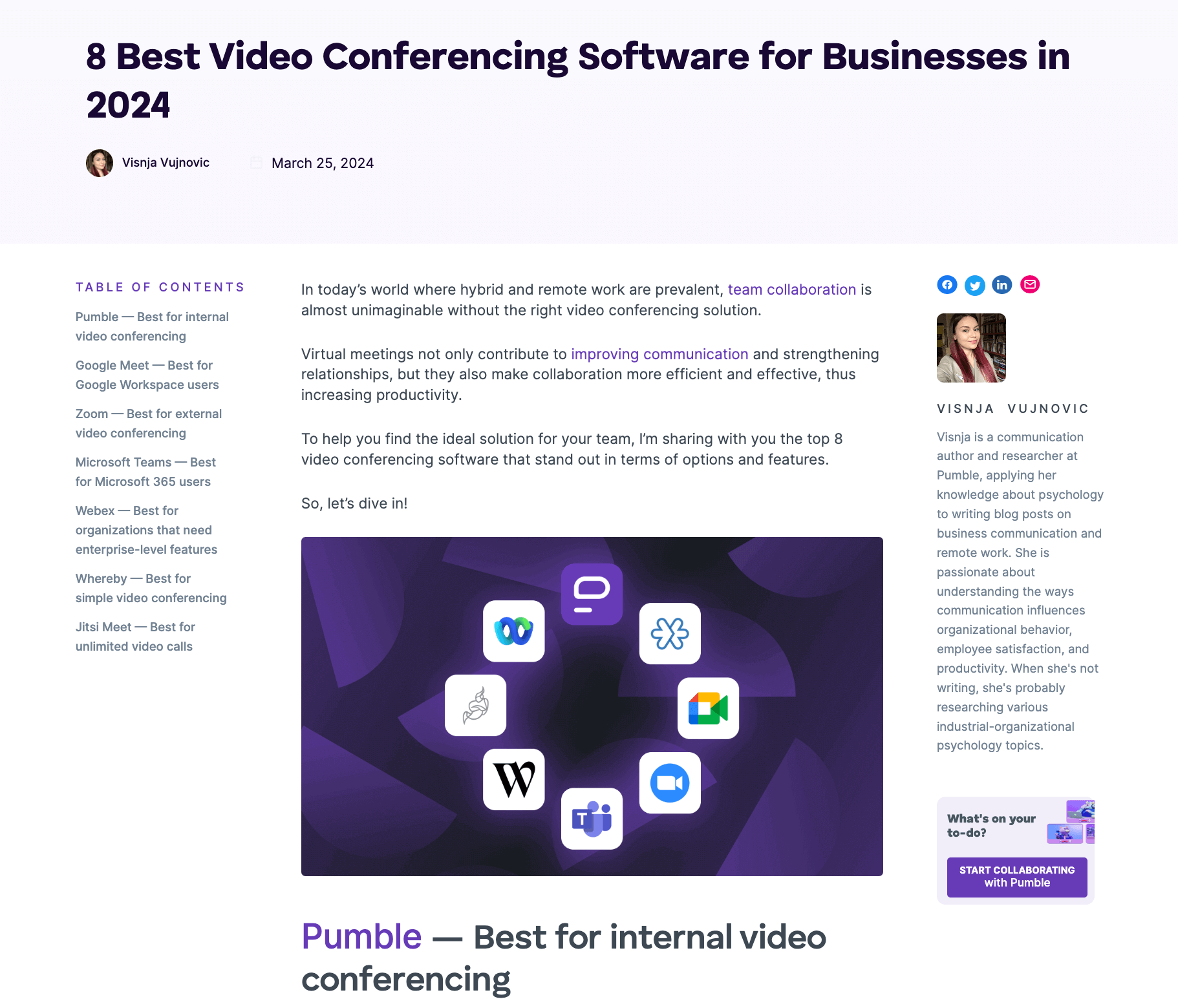
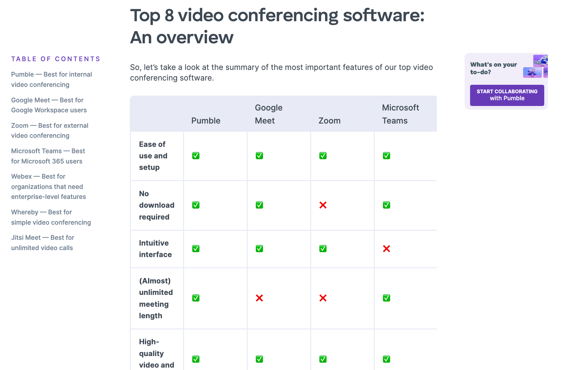
I really like the floating table of contents on the left-hand side, which immediately makes Pumble’s UVP clear—the other brands may be great, but if you want an internal video conferencing solution, we’re your answer.
The intro has a few clichés we could do without, (“In today’s world”, “let’s dive in”), and the lede image is a wasted opportunity (it could have shown Pumble in use), but the overall structure of this piece is very strong.
The highly formatted software reviews are mostly practical and scannable for the reader, the piece is highly responsive to the user’s search intent, and it clearly positions Pumble without denigrating its competitors.
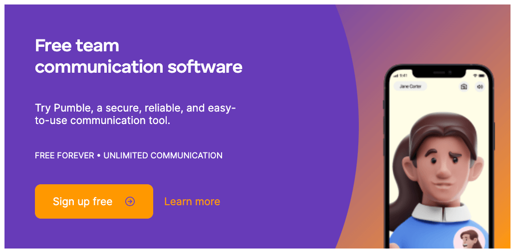
This CTA is a good example of concise writing—though I’m surprised it doesn’t also hit on the differentiating factor of Pumble being a solution for internal teams. Nevertheless, it’s visually strong and, were I looking for a video conferencing solution, maybe I’d take the plunge.
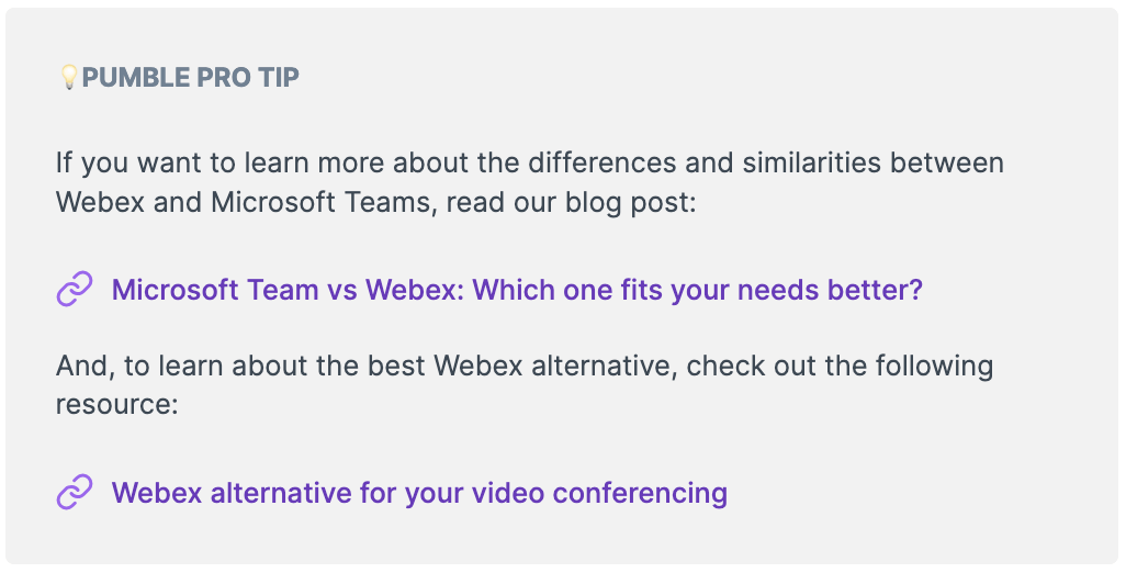
A clever trick this piece pulls is to squeeze in ‘Pro Tips’ after each competitor review. These attempt to guide the reader toward Pumble’s solutions via internal linking with other comparison pages. They’re not subtle, but BOFU digital marketing rarely is.
One area of weakness I spotted, though, is the meta description, which doesn’t reflect the search intent of the keyword. Instead of showing how the article will help the reader understand their options, it’s very product-led. This will probably result in fewer click-throughs.

The article concludes with a product comparison table, which should be an effective way to complete Pumble’s case. Overall, if you’re Pumble’s target audience, you should by now at least be intrigued enough to investigate further and perhaps sign up for a free account.
Conversion-optimized landing pages for bottom-of-the-funnel audiences
In some cases, your comparison page will be aimed at an audience that’s already carried out the bulk of their research. They’re familiar with the brands, the features, the pricing—all they need is a final push over the edge.
In this case, you can approach your landing page with less focus on informative, authority-building content that puts your hat in the ring, and instead create a highly formatted page structure that’s built for conversion.
When converting the reader is your objective, here are a few ground rules you should bear in mind:
- Don’t link off-page apart from to your book-a-demo page or whatever your conversion goal is.
- Keep your content concise and impactful. The most common mistake I see is overly long blocks of text—everything you write you should be able to say in a single breath.
- Always have your CTA button visible, whether through a floating button or repeated buttons that are always positioned above the fold.
- Focus on benefits more than features. What’s your reader’s end goal—is it cost savings, increased security, greater productivity? If so, that’s the story you should tell.
- Think in terms of UX. Your writing and editing team should be working closely with your designers so the reader has a frictionless journey to conversion.
Conversion-optimized comparison landing page analysis
This competitor-vs-competitor landing page (see it here: https://zapier.com/l/workato-vs-zapier) pits Zapier against one of its automation platform competitors, Workato.
Only it doesn’t. Because this Zapier landing page is so focused on conversion, it doesn’t even mention Workato outside of the H1 and tagline.
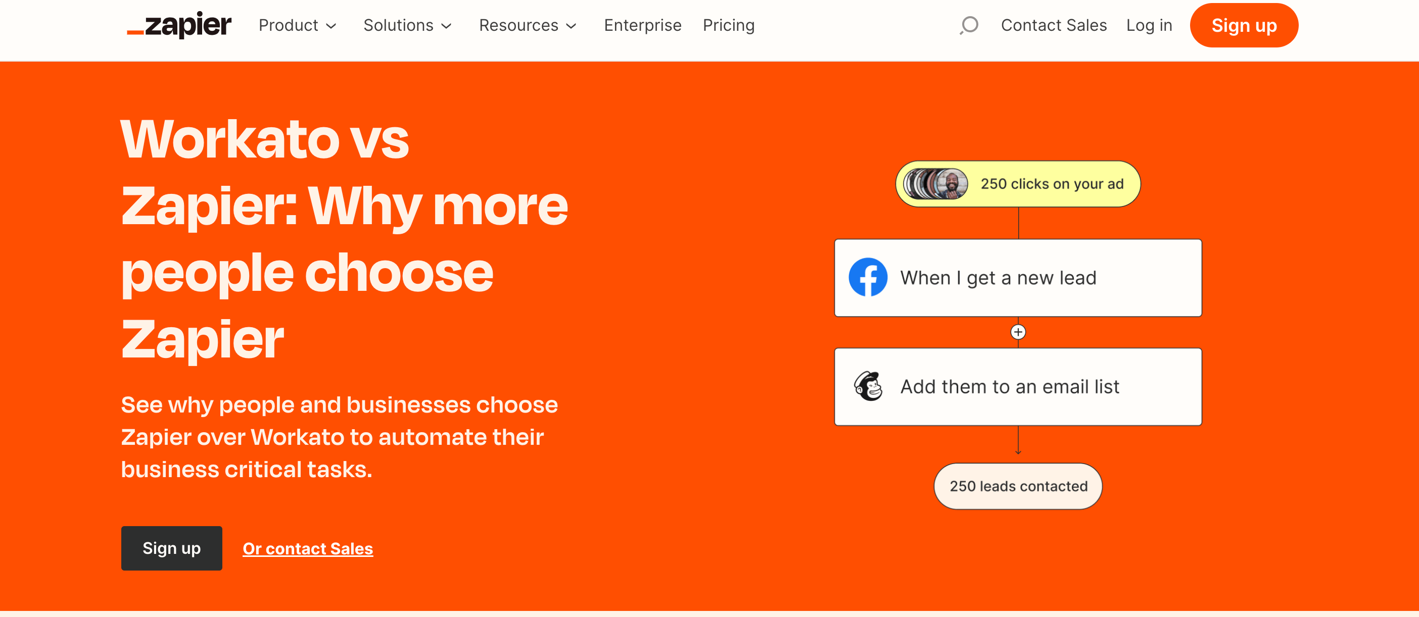
And I do have an issue with that H1 and tagline—they’re not hitting on any benefits. Plus, they repeat each other. If I were editing this, I’d probably ask the writer to include at least one key Zapier messaging point—ideally focused on a benefit where Workato is comparatively weak (this is why we create battle cards).
But maybe the content team feels that Zapier is such a strong brand, it’s not really an issue.
The page is nicely peppered with CTA buttons and the automation process is effectively illustrated. Maybe that’s another reason why the H1 and tagline aren’t so worried about resonating with key benefits—because the imagery does that work instead.
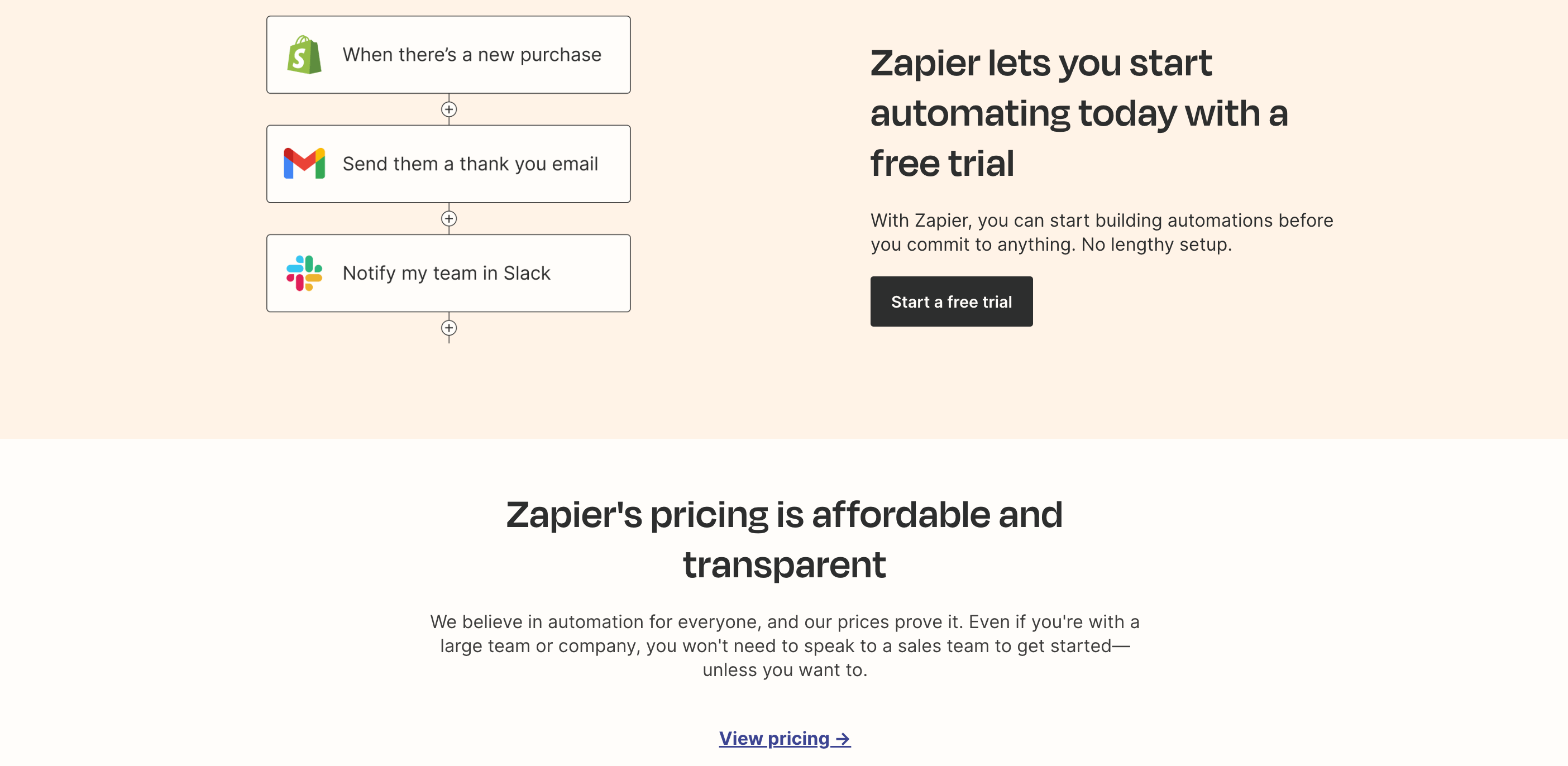
Also, notice how concise the writing is. In the screenshot above, you can see that all it takes is a couple of short lines to say something important—in this case, that you can start quickly and for free.
The page overall isn’t overloaded with information either, so the user has a very clear path to conversion.
And, having been given the opportunity to start a free trial across three separate CTA buttons, the page invites the reader to explore pricing, integrations, and the developer platform, where hopefully they’ll sign up later.
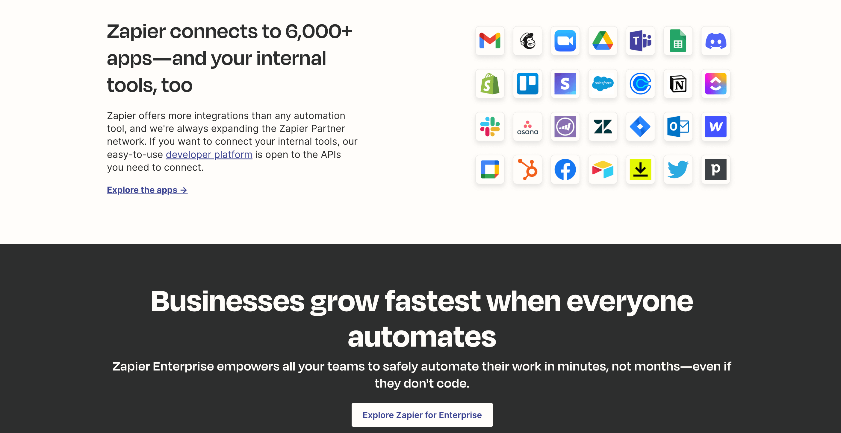
Overall, this is a positive experience for the reader. They’re not overwhelmed with product information; they can see that signing up is risk-free; and if they’re not yet ready to convert, they have the opportunity to continue researching other areas of the platform.
Competitor comparison landing pages that rank and convert
Competitor comparison pages can fulfill an important strategic role as you build your brand authority and position yourself in the market.
Of course, careful keyword research is integral to a successful SEO campaign but that’s not all—you need to understand your ICP, their stage in the buyer’s journey, and their role in the decision-making process.
As well as following technical SEO best practices, you also need content that’s engaging, informative, and aligned with the needs and expectations of your audience.
By blending these key areas of research and content creation, you can build landing pages that respond to your target audience’s search intent and resonate effectively enough for them to convert.
And, if you need support in any one or all of these areas, please feel free to contact the Flying Cat team! We’ll be happy to help with your questions so you can increase traffic, conversions, and ROI.
